Welcome back to another awesome post on data visualisation! Today we are going describe how to build revealing interactive scatter plots with Plotly for Python.
Scatter plots are very powerful at visualising correlations of 2D data and really useful when it comes to comparison between trends. Today we are going to build an interactive scatter plot using a practical example. On top of that, we are going to show some useful tips and tricks to build an interactive scatter plot with Plotly, and specifically with Plotly for Python.
Plotly is a computing company based in Montreal Canada that is building a cloud-based data visualisation environment for data science.
One of the think that we love the most of Plotly is the array of open source projects they are working on. The Plotly library for Python is one of those.
In the following we are assuming that you have correctly installed Plotly for Python. For more info on how to get started check Plotly for Python tutorial page here.
The plots you create with the Plotly for Python library, can be either stored on your local machine or hosted online. In the example below we will show how it works both ways!
Inspired by the recent debate on corporate tax cuts in the USA, we decided to look for some data in the OECD website and compare the Combined Corporate income tax with the personal income tax for the workers with average wages.
Data on the statutory corporate income tax rates for OECD member countries are publicly available on the OECD website here. Data on personal income tax (including social security contribution) can be found here. If you need the curated dataset, feel free to give us a buzz!
The whole point of making a scatter plot with these data, is to facilitate the comparison between the countries, by taking into account both factors.
Ok, here’s how we do it. Let’s begin with the imports.
import numpy as np
import pandas as pd
import plotly
from plotly.graph_objs import Scatter, Layout, Heatmap
import plotly.graph_objs as go
Now let’s read the data into a Pandas data frame and get the values of the axes
 df = pd.read_csv('taxrates.csv')

# Read values of axes
companytax = df.iloc[:,2]
personaltax = df.iloc[:,3]
This is the output of the first lines of the data frame. It has four columns, Country, Country code, Combined corporate income tax rate (%), and Total tax wedge for the average income (%).
In [10]: df.head(n=5)
Out[10]:
     Country Code  Combined corporate income tax rate (%)  \
0  Australia  AUS                                   30.00
1    Austria  AUT                                   25.00
2    Belgium  BEL                                   33.99
3     Canada  CAN                                   26.70
4      Chile  CHL                                   25.00

   Total tax wedge for the average income (%)
0                                        28.6
1                                        47.1
2                                        54.0
3                                        31.4
4                                         7.0
Column 2 and 3 contain the data we want to plot. Column 0 (or ‘Country’) has the string we want to use to identify the points in the scatter plot.
OK, here’s how you do the actual plot using the offline mode:
# Create a trace containing the scatter plot
scatter = go.Scatter(x = companytax, y = personaltax, mode = 'markers', \
                   marker= dict(size= 18, color = 'rgba(255, 0, 0, 0.8)',\
                   line = dict(width = 2, color = 'rgb(0, 0, 0)')),
                   text = df['Country'])

# Collect the trace(s) into the data to be plotted.
data = [scatter]

# Edit the layout
layout = dict(title = 'Corporate vs Personal tax, OECD member countries, 2017 data',
              xaxis = dict(title = df.dtypes.index[2]),
              yaxis = dict(title = df.dtypes.index[3]),
              hovermode = 'closest',
              )

# Define the figure
fig = dict(data=data, layout=layout)

# Save figure and layout into html file
plot_url = plotly.offline.plot(fig, filename='scatter_2017taxrates_oecd_simple.html')
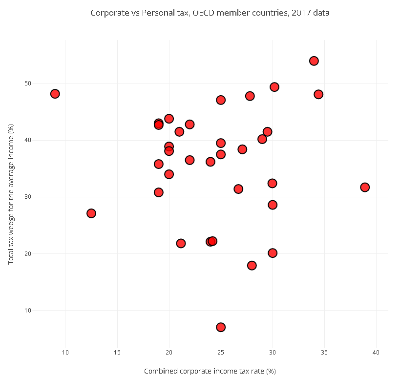
And this is the output, exported as static image file (note that the exported HTML will be interactive)
Not bad for a few lines of code, but we can do something better. The power of the scatter plot is to improve our ability to compare 2D data. Here for instance the 45 degree line would correspond to the theoretical situation where the company tax rate and the average income personal tax rate are the same. That means we could decide to use this metric to compare the OECD countries.
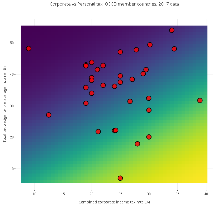
To make things visually more revealing, we’ll add a background that shows the progressive deviation from the theoretical 45 degree line. We’ll use a sigmoid function to do that, and here’s the code. First we define the function.
def sigmoid(x, y):
    '''Define a sigmoid function aligned on the 50/50 line
       to be used as background for the scatter plot '''
    return 1.0/(1.0+np.exp(0.1*(-x + y)))
Then we calculate the function on the defined meshgrid
# Define limits
rangex = np.linspace(np.min(companytax)-1, np.max(companytax)+1)
rangey = np.linspace(np.min(personaltax)-1, np.max(personaltax)+1)

# Calculate sigmoid function on a meshgrid
x, y = np.meshgrid(rangex, rangey)
background = sigmoid(x, y)
Finally we create two traces, one for the scatter plot, and another for the background heatmap with sigmoidal shape
# Create a trace containing the scatter plot
scatter = go.Scatter(x = companytax, y = personaltax, mode = 'markers', \
                   marker= dict(size= 18, color = 'rgba(255, 0, 0, 0.8)',\
                   line = dict(width = 2, color = 'rgb(0, 0, 0)')),
                   text = df['Country'])

# Create a trace containing the background heatmap
heatmap = go.Heatmap(z=background, x=rangex, y=rangey, colorscale='Viridis',\
                    showscale=False)

# Combine traces
data = [scatter, heatmap]

# Edit the layout
layout = dict(title = 'Corporate vs Personal tax, OECD member countries, 2017 data',
              xaxis = dict(title = df.dtypes.index[2]),
              yaxis = dict(title = df.dtypes.index[3]),
              hovermode = 'closest',
              )

# Define the figure
fig = dict(data=data, layout=layout)

# Save figure and layout into html file
plot_url = plotly.offline.plot(fig, filename='scatter_2017taxrates_oecd.html')
his is the screenshot of the result
That’s it! With the proper background in place it’s easier to see how the countries in the yellow-green region have a corporate tax rate higher than the personal tax rate. Most countries are actually at the opposite end of the spectrum, that is the personal income tax rate is much higher (double or more) than the corporate income rate.
This is all good, but if you want to use these results in a presentation, or attach the interactive plot to your post, the best way to do it is to create a free (or paid) account with Plotly, create your charts online and embed it into your document. This is the topic of the next section.
To be able to store your charts on your Plotly account, ou need to specify your user name and API key upfront.
plotly.tools.set_credentials_file(username='your-user-name', api_key='your-api-key')Again, check the introduction Plotly tutorial for more info on how to get your credentials.
Once you’ve done that, you really only need to change the last line of your code with this one
# Plot and store on the cloud!
plotly.plotly.iplot(fig, filename='scatter_2017taxrates_oecd')
Now the chart is available on your online workspace, and you can embed it into your page. Here’s how the interactive scatter plot looks like. The country name is displayed on hover.
That’s it for today. Hope you found this post useful. Thanks for stopping by!
| Cookie | Duration | Description |
|---|---|---|
| cookielawinfo-checkbox-analytics | 11 months | This cookie is set by GDPR Cookie Consent plugin. The cookie is used to store the user consent for the cookies in the category "Analytics". |
| cookielawinfo-checkbox-functional | 11 months | The cookie is set by GDPR cookie consent to record the user consent for the cookies in the category "Functional". |
| cookielawinfo-checkbox-necessary | 11 months | This cookie is set by GDPR Cookie Consent plugin. The cookies is used to store the user consent for the cookies in the category "Necessary". |
| cookielawinfo-checkbox-others | 11 months | This cookie is set by GDPR Cookie Consent plugin. The cookie is used to store the user consent for the cookies in the category "Other. |
| cookielawinfo-checkbox-performance | 11 months | This cookie is set by GDPR Cookie Consent plugin. The cookie is used to store the user consent for the cookies in the category "Performance". |
| viewed_cookie_policy | 11 months | The cookie is set by the GDPR Cookie Consent plugin and is used to store whether or not user has consented to the use of cookies. It does not store any personal data. |